Tuesday, April 16, 2024

Pirate, Spaceman, Cowboy, Knight

A Pirate, a Spaceman, a Cowboy, and a Knight all walk into a bar...or into some new designs. In a Plotmasters type exercise, I took an old drawing and tried to improve on both the artwork & the concept as a whole. I have no intention of developing this beyond a nostalgia trip and re-design exercise. You can see the results to the left, but in this post I'll explore where they came from and the process in revamping them.

In 1999 or 2000 I drew the piece on the right as well as a list of characters for the idea. In true Plotmasters fashion, the characters were clearly myself, Jesse Glenn, and the others would be based on the usual friends of mine that provided inspiration. I was clearly in my 'emulate Mignola' phase when I drew the Pirate and the Spaceman.

The overall idea was for a group of mis-matched characters to go on adventures together––and when I say mismatched, I mean in the same way a kid might team up action figures and toys from very different toy lines and in very different genres and scales. 

Sound Familiar? Toy Story, right? Well––it does match that franchise, and I did draw the original two as well as my list well after the first movie was out. But, instead I was influenced by an episode of The Twilight Zone called "Five Characters in Search of an Exit" where archetypal characters are stuck in a cylinder with no memory of how they got there only to find out they are toys in a Christmas donation barrel. And instead of a Soldier, a Hobo, a Bagpiper, a Clown, and a Dancer, I went with toy genres that were popular when I was a kid, but also seemed timeless.


And I have to admit, even in the re-designs, I couldn't get away from Toy Story, and so I leaned into it. My first step for the re-design was to draw the characters that had already been visualized, but this time to play with proportions to make them more stylized and toy-like.

I pushed the horizontal of the Pirate, making him low and squat, with the only vertical height being given by the ostentatiousness of his feather and sword. The Spaceman I wanted to push into a shape beyond what a human could wear as a costume and embrace a design of something more futuristic...though I think the design borrows a lot from Lego Space sets and Gizmo Duck.

To keep this exercise simple, I opted to ink them large and with a brush pen––focusing on the overall shapes and concepts and not on details and textures. This was inked on a 12" x 12" piece of Strathmore Bristol.

I remember being torn at this point in the process about the characters as toys vs characters inspired by toys Toy Story/Twilight Zone issue. And I wish I'd included a base plate (like on plastic army men) on the Pirate's foot & peg to make him much more obviously a toy.


I then scanned the inks and colored them in Photoshop. Rather than my normal Mouse Guard style of coloring, I went back to a technique I did on a Plotmasters episode for 'Hero Squad'. 

For this process each character is colored with flat base colors. Then a layer is placed above that set to 'multiply' and a pale purple is used to paint in flat shadows––same process but a layer set to 'screen' to create highlights. The last steps were to add color holds to the Spaceman's logo and face and a crinkled paper background to the duo to project the feel of this being part of a kid's imagination.


Written on the original drawing were two additional characters (I'm sure I was even considering more, but stopped at 4 in total): Cowboy & Knight. The trick with doing a modern drawing of a friendly toy cowboy is how to avoid Woody from Toy Story. I really leaned in to the toy-object idea and made his head and body wood block, his arms and legs rope and his hair and mustache yarn. 

The Knight I decided could be a material opposite to armor and made him a knitted plush. The cowboy design is based on my college friend Seyth––the Knight I don't know––perhaps Nick (see Cats TrioDragons, or R-Wars).


Like the others, I inked these on 12' x 12" Strathmore bristol with a brush pen. I like how they tall gangly Cowboy and short squat Knight shapes echo the first two re-designs of the Pirate and Spaceman.

I did worry that I was going to have to do more detail on these compared to the others just to get the materials of the yarn & rope across. Being aware of that helped me me better about not going down a rabbit hole of texture and detail and to just limit it to define basic forms and imply materials.

I think it's fun to imagine that while the previous two characters were store bought, these two toys were hand-made for the child, or that the cowboy especially was an older broken toy with knotted rope used to replace missing pieces.

The coloring process was the same as before, but this time I had a harder time choosing the base colors. There's a long tradition of me-characters being red and Jesse characters being blue. 

I know Seyth's favorite color is green, but how to make that work as Cowboy attire (when I so dearly wanted that bandanna to be red) took some subtle adjustments until I got something that worked. For the knight I just used Yellow & Orange to round out a Primary + Green scheme. I like that it makes the Knight look even a little more cautious and timid rather than the association of bravery with a knight.


Here again are the quartet together––just drawn for fun as an exercise. 


Where I think this idea could still work and differentiate itself from something like Toy Story or the Twilight Zone episode is for the characters-as-characters to exist only in the imagination of the child. Unlike Toy Story where the toys really are alive, these would be inanimate toys, but ones where the child living through some kind of distress (anything ranging from detention or being grounded to dealing with a terminal illness or an abusive parent) uses the toys as talismans and imagines the things they do that help the child navigate emotionally through the situation.

*PS*
Another idea of how to use these characters/designs would be in a co-operative video game set in a house (bedrooms, bathrooms, kitchen, etc) where each player can control one of the toys. They can pair up to accomplish special moves (the pirate can be hooked on to the cowboy's lasso and be thrown up to a higher location, the knight can ride the spaceman to joust objects out of the way, etc) each character would have their own pros and cons (the pirate walks slow, but has good reach with the sword, the spaceman is fast but makes the most noise, the knight is squishy and can fall without taking damage, etc.

Tuesday, April 9, 2024

Cosmic Jellyfish Dragon

Earlier this month on my Twitch Stream, we did the #DiscoveringDragons Community-Draw-Along! It's a fun event where I welcome all skill levels to push their pencils (or whatever tools they use to make art). It takes place on the first Friday of the month.

I worked on my piece live on my Twitch stream while viewers worked at home and then on the following Monday we shared our finished pieces.

Here is my finished colored Dragon. And below are my steps to create it as well as the community submissions.


For #DiscoveringDragons, I post two or three prompt words for everyone to make into a dragon. It's a nice framework for artists of any skill level to focus some time on an 'assignment' to shake the rust off or get the pencil moving again––all while also being loose enough that there's plenty of room for individual expression and interpretation.

This month the prompt was two words: Cosmic & Jellyfish

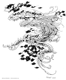
I opened several tabs of google image searches of Jellyfish, the Cosmos, and a few images drawn by Nate Pride: Blight Drone 001 & 'The Darkness Consumes All'


I started on copy paper with the head and a basic idea for the overall shape, but then quickly scanned it and built up most of the body, horns, and tendrils digitally. 

I printed it out to start inking but realized I didn't have the Jellyfish Bell drawn well enough and I thought my digital tendrils were too wispy. 

So, I did a lighbox draw over on a clean sheet of copy paper to formalize those elements (seen here after scanning in a purple/magenta tone).


I printed out the above design and taped that onto the back of a sheet of Strathmore 300 series bristol. Using a lightpad, I was able to see through the surface of the bristol as I inked the dragon. I used Copic Multiliner 0.7 pen to ink the art.

The inking on this piece was all about managing those black areas that make the creature look transparent while also conveying that it is made up of galaxies. The Jellyfish bell and tendrils were something I tried to use a different texture for and practice more restraint with. I was unable to finish the inks on-stream, but returned to them later that night off-stream.

The next day, I scanned the inks to I could start the coloring process. After prepping the digital scan of the inks, I established color holds (areas where I want the inks to be a color other than black––on the overall lines to a dark blue, a purple for the Jellyfish bell, and a magenta on the tendrils

Then it was time to start the color flatting process––basically professional coloring-in-the-lines. Some of this is just to make it easy to re-isolate various parts when doing later painting & rendering. I went with a medium blue (darker than in my rough) for the base body, and a similar purple for the Bell & tendrils. For the spots on the bell, I used a very pale yellow as a contrast to the violets.

For the final colors I used a paintbrush to give some subtle color transitions in the body before using the dodge and burn tools to create the highlights and shadows. Each little star and planet and moon had to be carefully gone over with the dodge tool to make it brighter and a appear to shine inside this dragon's body. To make the bell seem more cosmic I painted white stipples all over it like a field of stars.

Below you can again see the final Dragon...


But, as this is a community event, I wanted to share all the other entries posted in the Discord. 


88 Uncle Ernie


Capt. Nemo


Dakota


Doombot79


jodudeit


Jonathan Towry


Knickolaus


Kyle Gerbrandt


Nate Pride


redSkwrl


VernNYC


Tuesday, April 2, 2024

Grandparent Mice

Before Mouse Guard was a comic, when I was still in college, I made some mouse-versions of my Paternal Grandparents as Christmas gifts. I remember sculpting them in my workspace in my Dad's basement when home from school on Christmas break. These were made with Sculpey, an oven baked polimer clay. The eyes are bicycle ball bearings.

Unfortunately, these did not stand the test of time and I'd repaired them so many times with super glue and epoxy that they were a mess and still crumbling apart. I took a few photos of them before they fell to ruin.

My Grandmother was the prototypical grandmother, she was kind, loving, and a consummate cook & baker. 

As fans of Mouse Guard know, I based the very idea of having the Guard run by a Matriarch on my Grandmother's role in our family. More recently, I've made her part of the Mouse Guard with a Matriarch named Dorys who is depicted in the stained glass of the Matriarch Chamber as well as a piece in the 2024 Callendar: https://davidpetersen.blogspot.com/2023/09/dorys-matriarch-cook.html

I sculpted the head for this mouse separately, and then later sculpted a body/dress––which is pretty out of proportion or capable of containing legs, and then attached them with a dowel. She's wearing oven mitts and presenting one of her famous pies.

My Grandfather fashioned himself a bit of a cowboy––and for good reason, he did have a natural way with horses. Though most of his life was lived in the city of Flint, he grew up on farms. In their senior years my grandparents wintered in Arizona, where my grandfather would drive a team of horses in the Tucson Rodeo Parade.

He wore a lot of Western style shirts and belts, so his mouse has cowboy boots and a neckerchief bandanna while riding a hobby horse. 

His mouse was the more crumbly of the two sculptures and lost most of an ear to dust before the end.


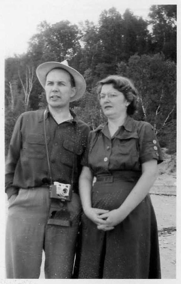
Gilbert & Doris Petersen on Lake Michigan


Tuesday, March 26, 2024

Skullduggers Concept Art Revamp

Beware the Skullduggers, a group of diminutive animated bones who use the scrap gear and weapons of fallen fighters as they tunnel and mine to excavate more of an equipment horde as well as bones of the dead to stock their own ranks with. 

They can range from a lone goblin-sized miner to a swarm of calamity miscreants all the way up to a legion of undead ready to murder the heroes and townspeople and collect all their possessions to repurpose for their own use.

Well––at least that's the idea of what they are. In fact, they are a re-design of an old drawing I 'unearthed' when scanning pencil drawings for my Patreon.

Back in the earliest of the 2000's, I was toying with the idea of creating a table-top game (like Warhammer) with simpler rules for movement, army creation, etc.

While struggling to design those elegant game mechanics (which never materialized) I only ever drew a few of the types of creatures one could populate their fighting forces with.

To the right is that old drawing of a single Skulldugger (I envisioned these were the minion pawns that could respawn.


As a just-for-fun exercise, I thought it would be fun to redraw and redesign and older concept piece of mine like this (Plotmasters style). I hope to do this with a few of the other drawings I've found when scanning things for Patreon.

I penciled the mining Skulldugger first, but then decided that the concept art should reflect the idea that these are a throng of minions rather than one unique character.

So, on other sheets of copy paper I drew one with a lantern (inspired from a character in Hellboy: Wake the Devil) and a glimpse of one in armor. These were scanned and assembled and then given a quick color splash to help me see the forms easier.

I printed out the above layout and taped it to the back of a sheet of Strathmore 300 series bristol. Using my Huion lightpad I was able to see through the surface of the bristol to the printout below and use it as a guide to ink from. I used Copic Multiliner SP pens.

It was important to to overwhelm the inks with too much texture, so I tried to limit it to their gear where I needed a material or rust to be obvious and also to help break up the space between the larger open areas in their designs.

There is a tanget I regret in the armored one's eye socket and the rust spot on the front one's pick axe---it looks like a continuation of the opening...but I knew I could improve upon it with color.

The first step after scanning in the inks for digital coloring is called color flatting/ It's basically a professional version of coloring inside the lines.

I'd roughly established a color scheme for the front Skulldugger when doing the pencils/layouts, and opted to keep that look and expand on it only a bit to fill in the other two characters. 

These little minions should be dusty, dirty, and corroded––so I liked going with a cohesive muted palette. At this stage I also established color holds (areas where I wanted the lineart to be a color other than black) on the lantern openings and the miner's candle flame.


Here again are the final colors. They were rendered using the dodge and burn tools in Photoshop and a stock textured brush. 

I have no immediate plans for what to do with these guys, but between my Draw The Extinct creatures, Discovering Dragons, and a few more like this––I seem to have a nice bestiary for fantasy gaming...

Tuesday, March 19, 2024

Rusty Iron Swamp Dragon

Earlier this month on my Twitch Stream, we did the #DiscoveringDragons Community-Draw-Along! It's a fun event where I welcome all skill levels to push their pencils (or whatever tools they use to make art). Usually it takes place on the first friday of the month, but due to ECCC, it got pushed back (as did this blogpost--sorry)

I worked on my piece live on my Twitch stream while viewers worked at home and then on the following Monday we shared our finished pieces.

Here is my finished colored Dragon. And below are my steps to create it as well as the community submissions.


For #DiscoveringDragons, I post two or three prompt words for everyone to make into a dragon. It's a nice framework for artists of any skill level to focus some time on an 'assignment' to shake the rust off or get the pencil moving again––all while also being loose enough that there's plenty of room for individual expression and interpretation.

This month the prompt was three words: Rust, Iron, & Swamp

I opened several tabs of google image searches of Rusted Iron, and Alligators (because without a swampy background I thought getting the anatomy cues of an Alligator would telegraph the environment)


I started on copy paper figuring out the overall body shape and how to make it both an alligator, while also looking like a mythicar creature and not just a big alligator. In pencil I focused detail only on the head and arm before scanning it into Photoshop to block in the shapes and forms for the rest.

With a big digital brush I painted in how I wanted to rpeat that scale pattern as well as color notes for where I wanted the back ridges/spines and draped swamp-muck. Last minute a blocked in some wings and a burping gassy alligator skull and crossbones. 

I printed out the above design and taped that onto the back of a sheet of Strathmore 300 series bristol. Using a lightpad, I was able to see through the surface of the bristol as I inked the dragon. I used Copic Multiliner 0.7 pen to ink the art.

The inking on this piece was mostly about that scale pattern and getting it to bend around the form and to taper off and fade out where I needed. I was unable to finish the inks on-stream, but returned to them the next day off-stream.

Right after the inks were finished, I scanned them so I could start the coloring process to try and save the form of the piece. After prepping the digital inks, I established color holds (areas where I want the inks to be a color other than black––on the overall lines (to a dark brown) and a pale green on the gas breath effect

Then it was time to start the color flatting process––basically professional coloring-in-the-lines. Some of this is just to make it easy to re-isolate various parts when doing later painting & rendering. I went with a bluer-grey to get away from alligator and still imply 'iron'. I did start splotching in some of the rust effects here, so this image is a half step past the flatting stage.

For the final colors I did most of the highlights, shading, and texture with the dodge and burn tools and a stock photoshop texture brush. I like the glowing gassy mouth, and the idea of the rust, but I kept going back and forth between how much is too much and how much is not enough. Below you can again see the final Dragon...


But, as this is a community event, I wanted to share all the other entries posted in the Discord. 

88UncleErnie

CaptNemo


Dakota


fidelea


Jonathan Towry


Knickolaus


Nate Pride


RedSkwrl


Tyberius


Tyrie


VernNYC


Blog Archive