Tuesday, June 28, 2016

Mouse Guard: Art of Bricks


Tomorrow sees the release of Archaia publishing's Mouse Guard: The Art of Bricks showcasing the wonderful LEGO display put on by ARCHLUG (the Seattle LEGO Builder Club). The display was originally built and displayed in 2015 and then was updated and shown again in 2016 at the Emerald City Comic Con. For the fans of LEGO or Mouse Guard who couldn't make it to those events, or want to admire the work again, this photo art book is a full look at Mouse Guard in Brick form.


I have written a foreword for the book. And to accompany it, I drew a pinup image of the Guardmice in Brick-form.  Today's blogpost will go through the steps in creating that piece. I started by pulling down my LEGO model of the Matriarch chamber given to me at ECCC'15 by Alice Finch. I used the Mouse Guard mini-figs that Guy Himber at Crazy Bricks sent me to set a scene of familiar mice gathered around Gwendolyn.

After I took a photo of the diorama model, I cropped and enlarged it to suit the format of the square book, and then printed it out to-scale. On my light box I traced over the printout on a clean sheet of paper to get my drawing. Normally, I don't like blatantly tracing reference photos. I've done it in the past, and it's a shortcut that often does more harm than good (it sticks out like a sore thumb, you don't usually have photo reference from other angles, and it's a crutch that is easy to grow accustomed to.) However, because of the precise geometric nature of LEGO and the deadline on this piece, I did exactly that.
(Note: I still had to figure out the vanishing point to make some corrections as I went)

The next step, once I had a clean line drawing, was to ink the piece. I taped my pencils to the back of a sheet of Strathmore 300 series bristol. And seated at my lighbox again, I started inking with Copic Multiliner SP pens. I made an effort to add some texture, dings, dents, and line weights so that the end result didn't look like a traced technical drawing.

I also made an effort to not use a ruler and draw every line straight. For the floor I tried to emulate some of the LEGO tiles poping up a bit.

After the inks were completed, I started flatting the colors in Photoshop. I pulled up a color chart for the official LEGO brick colors to use for my palette, but found it a bit too restrictive and used it as a guideline instead. You'l notice the weapons, books, and some miscellaneous items are drastically the wrong color. I'll often do that with all the little fiddly bits of minutia so make sure I got it all flatted. I then will desaturate that later and color each item as need be.


The last step is to do the final rendering. Because these are supposed to be like LEGO, I went a bit more drastic on the highlights than I normally would. I used the Dodge tool to add those highlights and the shadows were applied using the Burn tool (I used a textured brush with both). For the weapons, I didn't follow the LEGO tendency to have a single color of molded plastic (only getting multiple colors with stamp printed details) in favor of making the items look more like their Mouse Guard comic counterparts.


This pinup, along with my foreword and some special brick endpapers (see in-process image below) will be included in Mouse Guard The Art of Bricks out this June.


On Sale: June 29 2016
-Price: $34.99
-Page Count: 240


2016 Appearances:

Tuesday, June 21, 2016

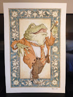
Mr. Toad Heroes Con Auction Piece Process

Every year HEROES CON has an art auction. The proceeds go to help fund next year's HEROES CON, which is one of the last remaining independently owned comic-centric conventions. Shelton Drum & Co. Do a fantastic job of making everyone (exhibitors & attendees alike) feel at home & welcome. Some folks do their piece for the art auction up on a live art-stage at the convention (where attendees can watch the process). I've done that a few times, but prefer to do my piece at home in the studio where I can take more time, assure a level of quality, and not take away any table time for fans at the convention. For today's blogpost, I'll be sharing my process from start to finish:


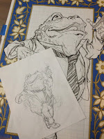
To start I decided to do a Mr. Toad piece this year because of my upcoming Wind in the Willows book coming out later this year. I robbed a rough sketch for one of the interior illustrations and made a few alterations so that it worked as an isolated stand-alone image. I also added in parts of a stock border pattern I found online and printed out an enlargement to match the size of the mat-board stock I was going to be painting on to. The printout (shown w/ sketch below is a taped together quilt of 8.5" x 11" printer paper pieces. You may be able to see a faint grid on the piece, I used that to help me re-assemble the printouts in proper registration.


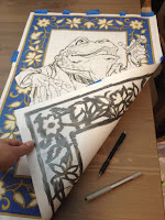
To transfer the image onto the mat-board, I had Julia rub a graphite stick on the back wherever there was art. She did this work on the lightbox so that she could see through the paper and only apply graphite where it was needed and not everywhere. I know some fans & other artists questioned why I didn't just use carbon/graphite paper. I opted this method because it was just easier, I didn't have any of the transfer paper, but I did a have a graphite stick...and I'd done this before and knew it would work.


With the graphite backed printout taped to the mat-board, I re-drew over the lines with a ball point pen. Wherever I applied pressure with the pen, the graphite of the back transferred onto the surface of the mat-board. To ensure proper registration of the transfer, I taped the printout down well on multiple sides so that it couldn't slip or shift as I worked. Below you can see the image fully transferred. There were a few gaps or odd points where the graphite didn't come off or I missed tracing over a line with the pen, so I drew with a pencil right on the mat-board to fix those spots.


First step in the painting process was the lightest of washes. I used a cheap large watercolor tray, the kind of tray they give kids in schools...nothing fancy. Here I focused on getting the lighter details in the border and the background behind Toad a warm pale yellow/beige.


The first washes dried, and I applied more to build up warmer colors, variance of tones & values, and subtle little organic textures. I also added a detailed darker wash to the darker warm-border elements.


The skin tone on toad started with warmer yellow greens, especially around his lower jaw-line and the palms of his hands. Looks like while I had the yellow part of the pan still wet, I also got Toad's necktie & shirt started.


The light orange washes were then started on the jacket and pants while I added darker greens and rendered details to Toad's face.


I'm starting to sound like a broken record describing the additional layers of watercolor washes, but that's pretty much the process over and over...sometime applying it onto wet or damp work or waiting until that area is dry (or bast it with a hairdryer if you can't wait) depending on the desired effect. Here I added more tone to the jacket, pants, and cigar.


The last painting step as to add the darkest tones and sharpest details. The blue-grey border tone was something I raced to get done, because I was then delivering this piece to Comfort Love & Adam Withers, artists from Michigan who were driving down to Charlotte for Heroes Con. They graciously offered to deliver this 20" x 30" piece that would not fit in my luggage....but I wasn't done with it yet...


When I arrived in Charlotte and got my piece from Comfort & Adam, I went into the 'inking' stage back in my hotel room. I put inking in quotes because, instead of using ink to add in clarity through line, I used a dark brown color pencil. Here below, I am getting the details of the border outlined (which was the most tedious part of the outline work)


The more enjoyable part of the color pencil work was on the figure itself, especially around Toad's knuckles.


Here again is the final piece. It raised $2,400 for Heroes con and went home with a lovely couple who came by the day after the auction so we could get a photo together. 


To see the process for last year's piece:


2016 Appearances:

Tuesday, June 14, 2016

Toned Paper Con Drawings

Instead of taking pre-order commissions as I've done at conventions past, a few weeks ago at the Motor City Comic Con, I tried doing head/bust drawings on toned paper at the convention. My schedule at home has been such that it left me no room to do pre-order commissions for conventions much this year. And I cant get more than 1-2 of my detailed ink pieces completed while at a convention either at my table or back in the hotel after dinner.

So, using toned paper, I'm able to do a piece that I'm happy with, has a full range of tonal value (without hours of cross-hatching & stippling) using a felt tip marker, a pencil, and a white gel pen.

Heroes Con is up next for me, and I'll be trying to do these types of head/bust single figure pieces live at the convention first come, first served..new list every day. I'd like to stick to mice (because I'm comfortable doing them and we will both be happy with the result) but I'd be open to discussing something else if it's in my wheelhouse.

Below are examples of the types of pieces:

Saxon

A Bell-Mouse

Alopex

Double Sword-Mouse

Mr. Toad
(This was a gift to Terry Jones of Monty Python)

Staff wielding Guardmouse

Hellboy


Leaf adorned Guardmouse

Hagrid

Ringmail Guardmouse


2016 Appearances:

Tuesday, June 7, 2016

Juniper Limited Edition Print

Since 2012 I've released a new 11" x 11" limited edition print every year. Past year's pieces have been titled "Peacock", "Raspberry","Moonflower", & "Lavender". Julia requested that these prints be pretty and not just a mouse doing battle, but more aesthetically feminine. To the left is the finished artwork, and below I'll show the full process.

The print is available in my online store and at my convention appearances until the print sells out
http://mouseguard.bigcartel.com/product/limited-edition-juniper-print

For this year's print, "Juniper" I have a mouse harvesting juniper berries as a northern pygmy owl watches. I drew the owl first referencing photos gathered from an online image search. And then I drew the mouse with her basket of berries (and a sword some eagle-eyed Mouse Guard fans may recognize). I also looked up reference for some medieval dresses, but other than finding a color scheme I liked, I didn't find what I wanted so I made it up as I went (though the hat is based on one I drew on a storyteller in Legends Vol 3) These were drawn separately on copy paper.

I scanned the drawings and then went about placing and resizing them within an 11" x 11" template in Photoshop. I hadn't figured out in the drawings how the two related to each other or how they sat (other than that because of the eye position of the owl, I'd planned for it to be Northeast of the mouse). With the Juniper berries as my plan, I collected some cedar branch images online and copied and pasted them around my drawings until I had a believable structure for them as well as an aesthetically pleasing framework. I painted in some branches and berries. And I had my layout all set.

I printed the layout onto two sheets of legal copy paper (being 11" square, the layout wouldn't fit across one sheet, so I had to print the top and bottom separately and then puzzle them back together). Using my lightbox, I was able to see through a sheet of bristol to the printout of my layout below. I taped the layout to my bristol to make sure I didn't lose registration as I inked. To the right you can see the finished ink (this was inked all with Copic Multiliner SP pens (the 0.7, 0.5, & 0.3 nibs). And below are several in-process photos I took as I worked:


Once the inking was done, I started coloring the piece. This process starts with a job called 'flatting' where you simply lay in flat colors to establish which parts are which colors. Initially, before I'd seen how busy my layout was going to get with all the cedar, I'd thought about setting this print in a snowy setting...perhaps not enough to have accumulated on the mouse, owl, or branches, but just falling delicately around them. I kept that in mind as I placed in these colors and I went for something a little cooler palette wise.


The final step was to render the image. This means going in and adding depth and texture with shadow, and highlights. I do this using the Dodge and Burn tools in Photoshop (and a textured stock brush). I tweaked the final colors a great deal on this piece trying to get the right cool/desaturated look without it becoming washed out or too bleak.

Again, the print is available in my online store and at my convention appearances until the print sells out.
http://mouseguard.bigcartel.com/product/limited-edition-juniper-print


2016 Appearances:

Blog Archive