Legends of the Guard Creator Spotlight: Nate Pride
David Petersen: Nate, I am pleased to say that Legends is the return of your work in sequential storytelling after 16 years! That being said, you have still been working in comics and illustration all that time. Tell the readers what you have been up to in that time.
 Nate Pride: I was shocked to realize it's been that long. Just to mention it, the earlier story was "Lazarus Lamp", a 10-page silent piece for an OGN called High Caliber. I have a background in the comics industry since 1990 working primarily on the design and production side of comic books. I switched work roles to being a freelance artist in 2002. Some of those early published illustrations were for White Wolf role-playing books and supplements. In 2008 I began working with Barnes & Noble art directors on various store exclusive books. Included in those titles was a project I was really proud to be a part of, Library of Wonder: Jules Verne Extraordinary Voyages, a collection of three of Verne’s stories that I supplied 60 black and white illustrations, cover art and endpapers for.
David: When I’m working on Mouse Guard, I bounce ideas off of you all the time for story pacing and panel layouts. You have a really good sense about graphic storytelling. Is panel by panel storytelling something you want to do more of? Or do you tend to prefer the single illustration with author text style of storytelling?
Nate: Thank you. Well, I love single panel illustration because I may not have to keep on model with characters and designs. I enjoy the larger single image that potentially gives me more room to put details in and draw something more dramatic. Yes, I would love to do more sequential work. I’m kicking around some plans on a couple of sequential projects currently. Some of my  love for storytelling came when I was younger. I became fascinated with storyboards, especially through the art & design books of the early Star Wars films. I'd always look for the Storyboard Artist in the credits of any film in theaters. I would still love to get my teeth into storyboarding a film project at some point.
David: I dropped a tight working space on your lap with your Legend’s story. Only three pages to tell a complete story. Did the shorter page count dictate how you thought about story concepts?
Nate: Yes, certainly it was a challenge. I knew that I had to get straight in and out of the story. No fussing about. I didn't have the option of multiple panels to control pacing in a normal way. But once I did the first thumbnails and realized what was essential to tell the story, I created the edited down panel layouts that I used for the pencils.
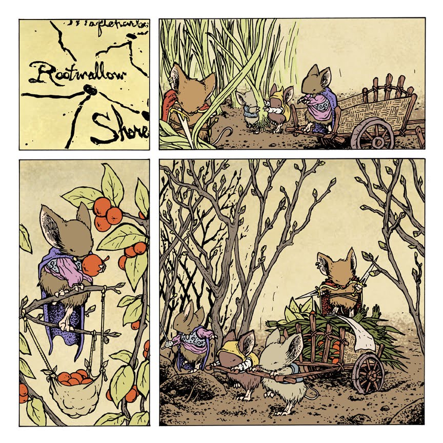
David: That being said, I think if the story is well crafted to fit in the space, three pages is plenty of room. And you did a great job of getting your idea told in that space. How did you go about the layout and pacing? And since your story was one of the most ‘out there’ in terms of pushing a legend or a tall tale, where did the story of a mouse who swallowed a river come from?
 Nate: Thanks. The idea came about when I sat down with a world mythology book to get some inspiration and to try and avoid what types of tales were frequently used. I noticed that the paragraph descriptions were very concise. So I knew I needed a legend that could be basically told in a sentence or two. I had a quick thought of something with feats of strength or with trials that might be good. I also wanted to create a legend that was grounded in some sort of Earth lore or centered on natural elements. Something that the mice may deal with regularly and could still have a greater power over them. Of the three ideas I jotted down, this one seemed like a better fit and was highly fantastical. The pacing was crafted after the initial story idea was conceived. I drew out really loose thumbnails of the pages and panels and worked on trimming those back to just the scenes that would best tell the story. I had to give up some longer dramatic transitions in scenes that were initially being kicked around because of the shortened format. I am really pleased though with the final layouts.
David: Another interesting side to your story, is that, when I told you the mouse in the tavern telling the story was a bard with a string instrument, you decided to write the text as a song. Talk about that process.
 Nate: Since this was my first ballad, I took on a lot with this story that forced me out of my comfort zone and am really pleased with it. The writing began strangely enough after I had finished the pages. Which I don't know if that was good or bad to do, but it worked in this case. I had the basic plot of the story written down previously and tried to connect my writings there, the art that was finished and the ballad style I needed. I began with writing down lines, scratching most of them out, until I had one stanza and a chorus that made me realize just how this whole thing was going to be written. After that it flowed much easier for me.
David: With thumbnails, how complete do you feel they need to be for you before you move on to the next step? And when you pencil are you doing most of the drawing work? or do you tend to leave things loose so you can make the decisions in ink?
 Nate: My thumbnails are mostly sketchy and loose, drawn smaller and enlarged to size before I begin penciling the page. I would say all of the detail comes from the pencil stage. I pencil really tight. I rarely like to leave a hand, or paw in this case, unknown to me before I begin inking. I also suggest for myself shading directions and textures in my pencils so I can feel more comfortable if the lines are working before I put pen to paper.
David: What do you use to ink with? And is there something in your inks that you try to achieve that isn’t in your pencil work?
Nate: I used Sakura Micron pens, specifically sizes 3-8 for this story. I think it’s more the opposite in that I struggle to include all the lines I put down in pencil. I love the soft, energetic lines I have defining my shapes in pencil. It’s very hard for me to achieve exactly that when inking them in a controlled manner. The ink is so stark compared to the softer line weights I get with pencil strokes.
David: When coloring this story, what was your process? Did you have a palette in mind while drawing and inking? or do the color choices come as you get into the coloring?
 Nate: The colors were decided after I inked the work. Partially through inking on each page I was evaluating my lines and whether I should add more dense or filled areas to the line art. While at the same time beginning to think about how those lines could translate to color or color holds. The color palette started as a washed out, parched environment, but I found myself pulling a little into stronger colors when I laid them in or was adding details. I worked in colors the way they may be applied on a canvas painting, with under painting and unexpected colors to make it appear more natural.
David: Where can people find out more about you and your work Nate?
Nate: I have a website, http://www.natepride.com/, that they can view my personal and professional artwork, commissions, a list of publications where my artwork is featured and news to stay current with what I may be working on. Thanks, David.
Nate's Story 'The Ballad of Nettledown' appears in Legends of the Guard issue 3.

 Screw-On Head: With this week being the release of the Amazing Screw-On Head and other curious objects Hardcover collection , I found it odd that I stumbled upon the original painting I did back in my watercolor/ink-outline days. I had scans of the painting, but thought the original was long gone (though I have plans for it now that I have found it) As readers of the blog know I'm a big Mignola fan and Screw-On head is one of those gems that got better with every reading and showed that you how other creators were still interested in doing something fresh and unique in comics. I'm very excited to sit down and read the collection which also includes the Eisner Award winning story 'The Magician and the Snake' that Mike co-wrote with his daughter Katie (7 at the time). And an excuse to share a painting I did of a character and creator that renewed my faith in something new & different lasting.
 College Comic Strip: Though I never drew a single strip of it, I had an idea for my college newspaper. The premise was two college roommates (Nick & Dave) who need a third roommate to split the rent. Nick goes out to find a new tenant and instead brings home a monkey. He rationalizes that the monkey can take care of the apartment, cook, clean, perhaps even do some of their homework, which will allow the two to pick up more hours at work (which they never do). Another character Mike was a friend who didn't live with the pair (and now a monkey) but might as well have been considering how much time he spent there. Mike was going through an identity crisis and chose to wear masks until he discovered his 'true self' and was ready to face the world (this is why he's wearing a pumpkin in this lineup, but the disguise would change every strip or so). Over the course of the run I planned on the monkey robbing a bank to help with the rent, going to classes for them, and taking pleasure in terrorizing Mike.
 D & D Character portraits: When roleplaying, I always enjoyed flawed characters (something the GURPS system taught me was beneficial to fun adventures). While I was trying to break in to doing illustration in 2001 or so, I did these character portraits for a fantasy roleplaying game. The focus I was working on were imperfect characters, not handsome or tidy, but folks missing teeth, with receding hairlines, covered in muck, scarred and homely. They are all rendered in pencil on white copy paper. Like much of the portfolio I took around at that time for work, lack a setting or background. It was fun rediscovering these as well as the above entries...never found what I was originally searching for, but the content for this post made it worthwhile anyhow.
 Fan Art: This week the fan art comes from Aaron Hawbaker who did a pencil drawing of the scene from Fall 1152 where Celanawe has reclaimed his axe and Midnight is at a disadvantage.